Question: How to address a market failure question
Hallo everyone! I’m back with another econs article. Today I’m going to be talking about market failure, which I feel is one of the more difficult topics in unit 1 (barring theory of the firm for all the HL kiddos) and is widely tested in both paper 1 for the micro question and paper 2 in parts (b) and (c) for the unit 4 question. So once you get market failure down it’s gonna be real helpful for many areas. This guide is mainly for the Y5s as it covers the basics of market failure but it’s a good revision for the Y6s as well and hopefully can help you with your speed in identifying and drawing market failure diagrams (which is vv important for exam pacing!) So let’s begin!
First I would like to give some examples of standard market failure questions from the TYS (which is your best friend in your exam prep). So some examples would be:
May 17 SP1/TZ2/Q1 (paper 1)
(a) Explain why demerit goods are an example of market failure
(b) Evaluate the effectiveness of using indirect taxation to correct market failure
Nov 19 HP2/TZ0 (paper 2)
3(b) Using an externalities diagram, explain why the percentage of infants receiving measles vaccinations in Nigeria indicates the existence of a market failure (table 1)
4(c) Using an externalities diagram, explain why the garment industry is a source of market failure (paragraph 8)
It’s important to know that most market failure questions in paper 1 are mixed with the other topics such as the price mechanism or price controls, so just like any other paper 1 questions, they are very varied across all the topics.
Let’s start off with the definition, What is a market failure?
Definition: Market failure is when the market fails to achieve efficiency in the allocation of resources in society, resulting in an overallocation or underallocation of resources in the absence of government intervention.
The key words here are about the allocation of resources, it’s important to make this link explicit in your answers and how resources are misallocated.
The 4 common types of market failure are already outlined in your notes, so I won’t be going through them each but I’ll give my important tips on how to identify the type of market failure and a failsafe way the diagram correctly, helping you save time on taking a long time to think through the different types of market failure, wasting valuable exam time !!
6 steps to tackle any market failure graph
- Does it have to do with consumption or production?
- Is the commodity good or bad?
- What is the benefit/cost associated with the good?
- Who is the third party and how are they affected?
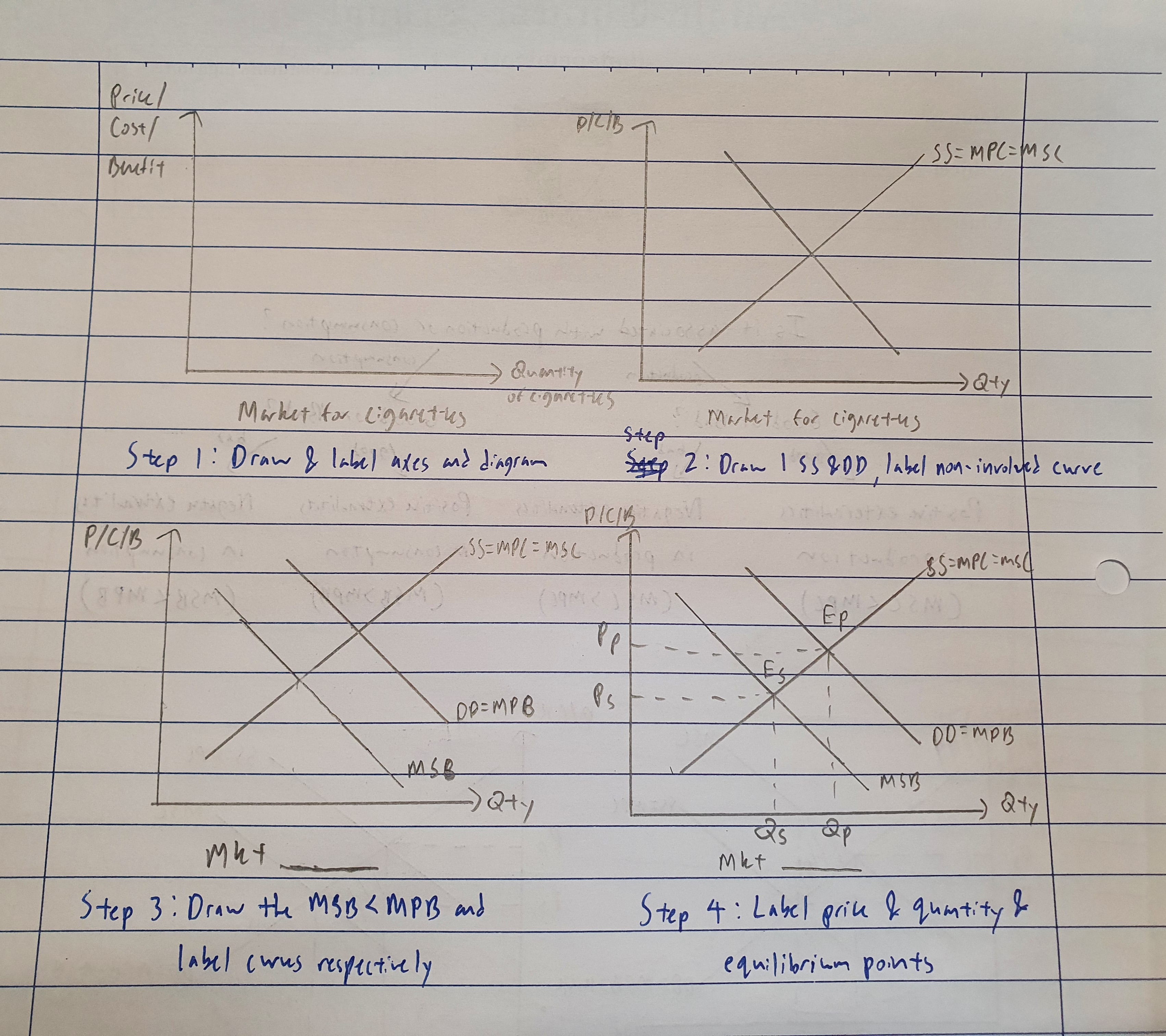
- Draw and label the axes and curves, indicate prices, quantities, welfare loss and over/under consumption/production
- Check whether everything makes logical sense!
Please refer to the associated diagrams because it may be difficult to understand through text.
Note: I like to draw my diagrams before my prose in paper 1, but it’s up to you to draw it before or after your prose. For paper 2 it is recommended you draw your diagram first.
Step 1 is to ascertain whether it has to do with consuming or producing the good. This is abit tricky, but it comes down to practice and common sense. Think whether the external effect comes from using the good. For example, using cigarettes creates the smoke, therefore it creates externalities in consumption. Note that for production, the good itself is not the problem but how the good is created. For example, the production of energy causes emissions from burning fossil fuels, therefore the market for energy creates externalities in production. This is a common mistake especially for common access resources, where the market is not for the natural resource such as rainforest or oceans, but for timber and fish respectively. It may seem slightly confusing but with practice and understanding it’ll be alright.
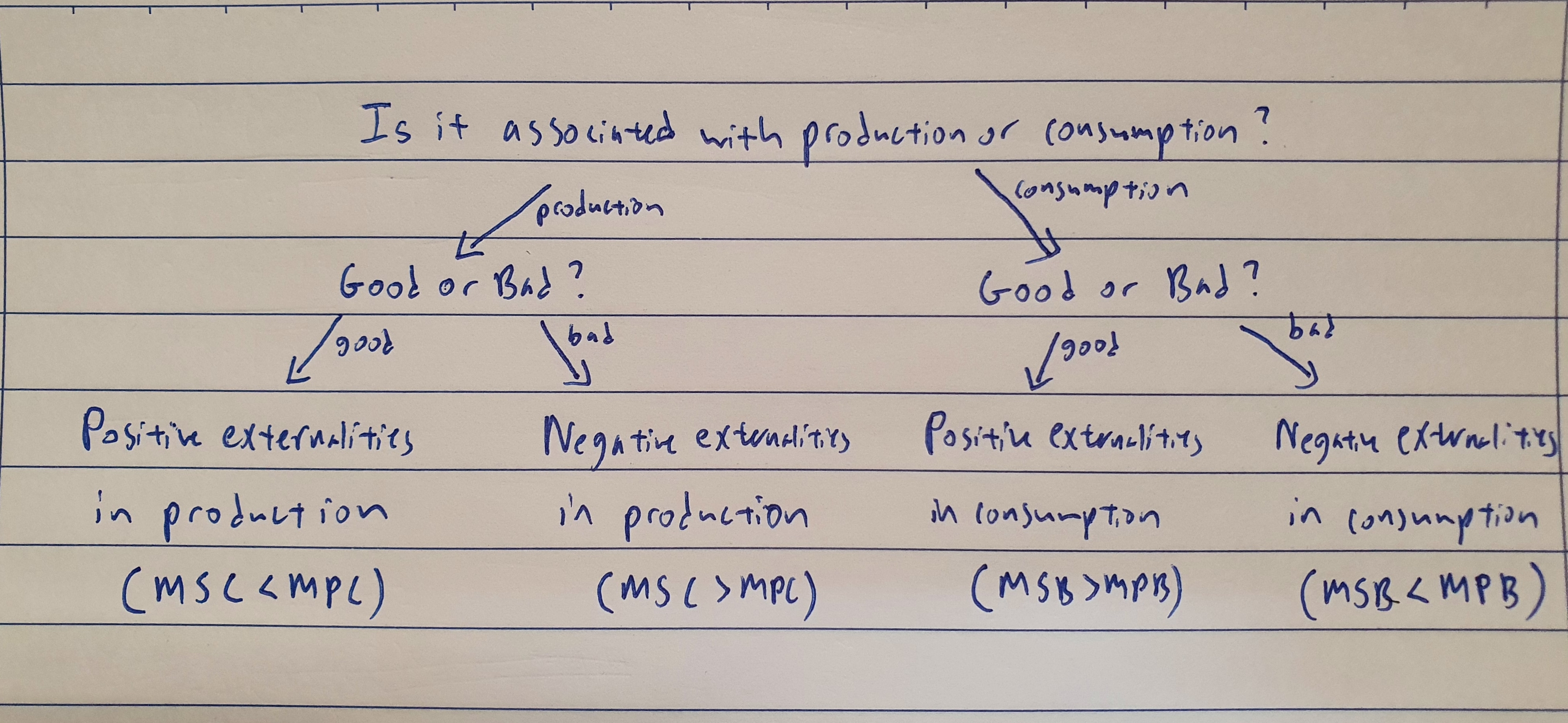
If it’s associated with consumption, it is the benefit curve (MSB) that shifts. If it’s associated with production, it is the cost curve that shifts (MSC). A good way to remember this is for any good, the consumers consume it to benefit, while producers incur cost when producing it. Benefit=consumption=demand shift (downward sloping), Cost= production=supply shift (upward sloping)
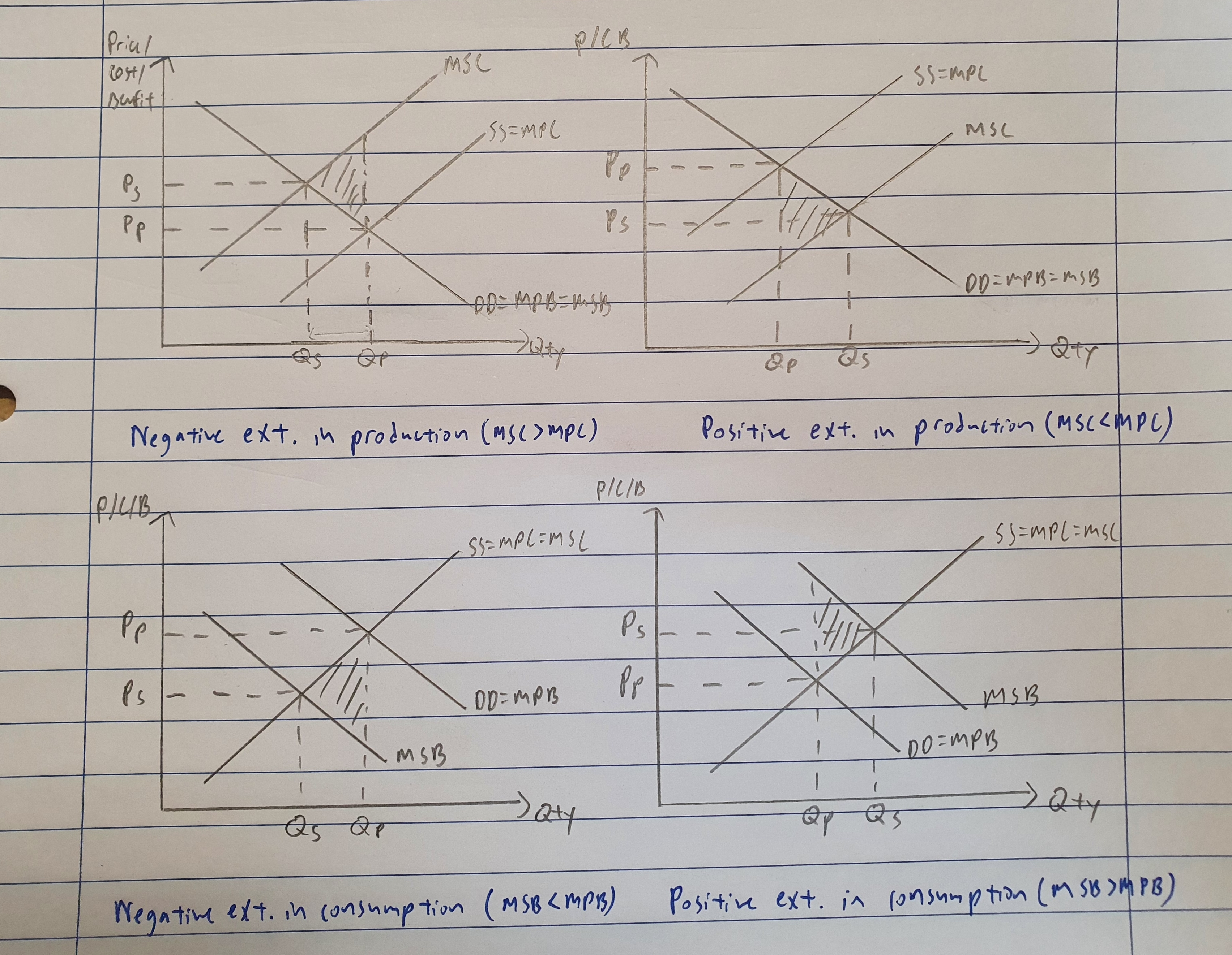
Step 2 is to identify whether the commodity is good or bad. For example, cigarettes and alcohol are obviously bad and vaccines, education and retraining are clearly good. If it’s a “bad” good, it has to do with negative externalities and there is overallocation of resources. If it’s a “good” good, it has to do with positive externalities and there is underallocation of resources. (please don’t actually write good and bad in your essays, it’s just for understanding, use econs terms like merit and demerit)
Step 3 and 4 can be combined. Note that the external cost or benefit must always fall on the third party, i.e. those not involved in the producing or consuming process. An example would be for the market for cigarettes. The external cost would be the second-hand smoke causing lung diseases, leading to increased healthcare costs, while the third party would be those that inhale the second hand smoke. (Note that the harmful effects on the smoker is not included since the smoker is the consumer, the third party must always be someone other than the consumer/producer) This should be mentioned in the prose.
Step 5 is drawing the graph itself. The important thing is to note the y-axis which is price/cost/benefit. This is what I use to ensure my curves are drawn correctly. Always start off by drawing 1 DD and SS curve first. From step one, label the curve not associated with the market failure first (For externalities in production label the DD curve first and vice versa). Labelling conventions are DD=MPB=PSB or SS=MPC=MSC for the non-related curve. Now to tackle the shifts in curve. Let’s look at the example for the cigarette market again. Since it is a negative externality in consumption, the supply curve would be labelled SS=MPC=MSC, which means assuming there are no externality in the production of cigarettes. Looking at the y-axis, you should be thinking in terms of benefit since cigarettes have to do with consumption as discussed in step 1. The third party does NOT benefit from the smoking of cigarettes, hence the MSB lies under the MPB (i.e. society benefits less than the consumer). Mark out to quantity and prices just like a normal DD SS curve. I like to use Qs/Qp and Ps/Pp to differentiate between the society curve and the private curve. This will help you with checking your graph. I also like to label my equilibriums with Es and Ep. Shade your welfare loss by drawing a dotted line either upwards or downwards from Ep until it cuts the society curve. The tip of the welfare loss triangle should always point towards Es. Now looking at the x-axis, since Qp>Qs, there is overconsumption of QsQp and indicate this in your diagram.
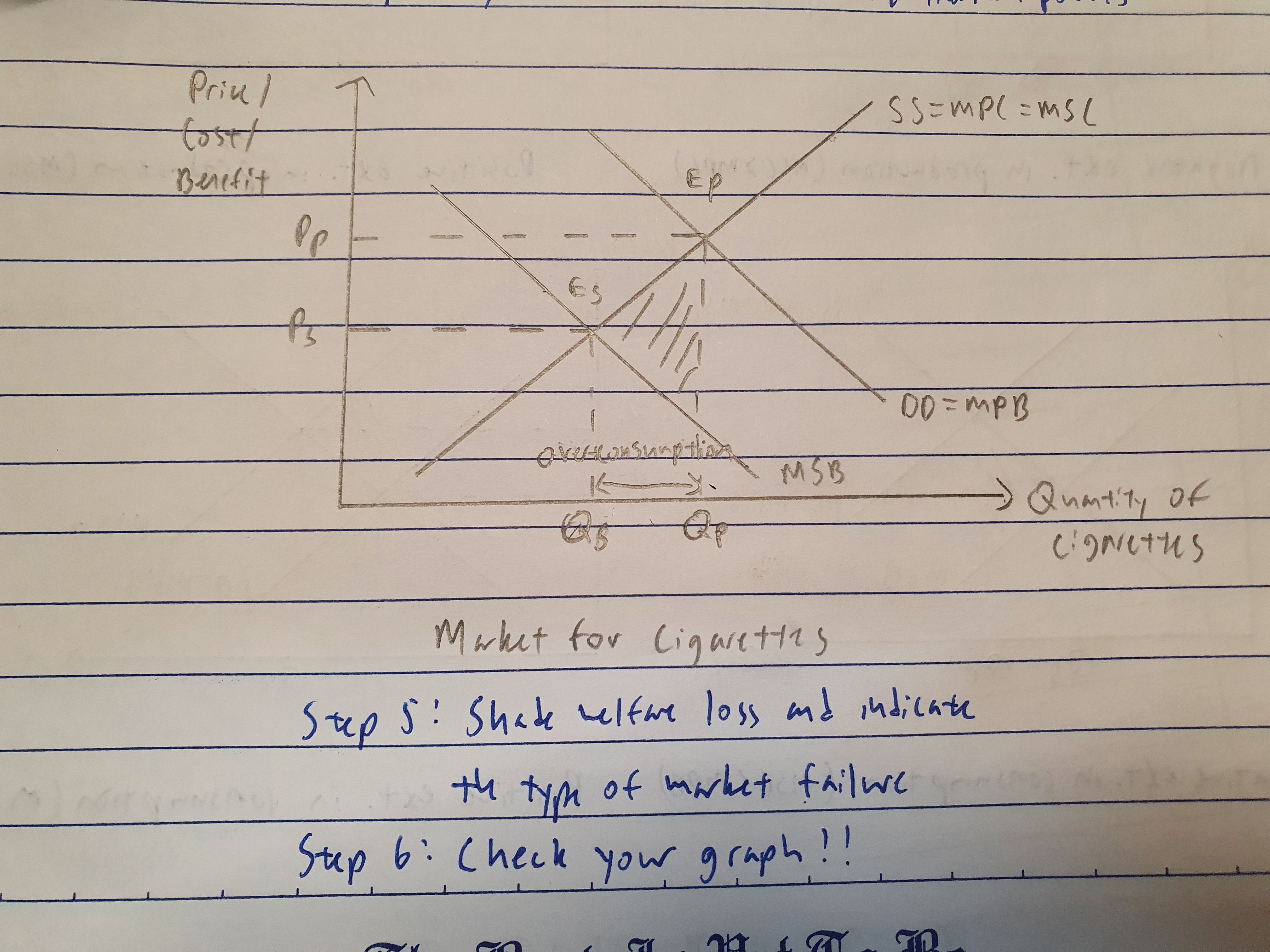
Step 6 is to check that everything makes sense. For example, if it’s negative externalities, the good is always overconsumed/overproduced (i.e. Qp>Qs). If it’s positive externalities, the good is underconsumed/underproduced (i.e. Qs>Qp). The welfare loss triangle always points towards social equilibrium (Es). Also check that in your prose the words overallocation or underallocation of resources must be there to show a market failure.
Part (b) will generally ask you about the solutions to these problems, so read up on the different evaluations in the notes and apply them specifically to the real life example that you have raised. I won’t be touching on this in this article but maybe in a future one :))
I hope you guys have learnt a few tips about market failure. Don’t be afraid to ask questions about this article if anything is unclear!
“A market can fail, but you won’t!” ~Anon Till next time :)
Author: Underdog